
Visual
Par Naïm Bada, Spécialiste logiciel.Publié le 20 mars 2025 à 07h50NotebookLM franchit une nouvelle étape avec sa fonctionnalité de cartes heuristiques qui transforme la visualisation des connaissances. L'assistant de recherche de Google, déjà adulé par le PDG de NVIDIA, devient ainsi encore plus pertinent pour les étudiants et professionnels confrontés à de grandes quantités d'informations.NotebookLM se bonifie ! © Clubic, générée par intelligence artificielleLancé initialement comme un simple « projet 20% » chez Google, NotebookLM s'est imposé comme l'un des outils d'intelligence artificielle les plus utiles de la firme de Mountain View, avant que son chatbot (Gemini) ne gagne ses lettres de… […]
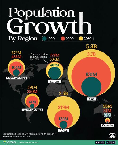
Mapping Population Growth By Region (1900-2050F) In fewer than 50 years, the world population has doubled in size, jumping from 4 to 8 billion. In this visualization, Visual Capitalist's Marcus Lu maps the populations of major regions at three different points in time: 1900, 2000, and 2050 (forecasted). Figures come from Our World in Data as of March 2023, using the United Nations medium-fertility scenario. Population by Continent (1900-2050F) Asia was the biggest driver of global population growth over the course of the 20th century. In fact, the continent’s population grew by 2.8 billion people from 1900 to 2000, compared to just… […]
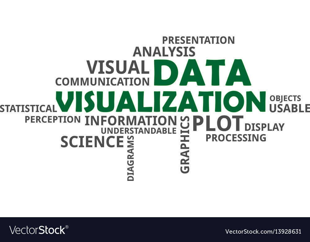
Data Visualizations are the best ways to get a feel for your data. In any data scientist’s or data analyst’s work, they predominantly own the EDA processes and crunch data in a way like no other process does. They go from the most basic bar plots to kernel density estimation plots (don’t bother what they mean) and can decode any patterns, outliers, details, etc. about your data.With software like Tableau, PowerBI, Qlikview, and the capabilities of programming languages like Python and R in terms of Data Visualisation, the possibilities are unimaginable.Before we dive into the article, I want you to… […]
Questioning Data Visualization as a conceptIn it’s essence, Data Visualization is as abrupt and abstract as the word means in layman terms. Visualizing massive amounts of raw or processed //filtered data. But Data Visualization // DataViz is as useful as to correctly pronounce the word croissant to a non-french speaking person, it could sound horribly wrong, at best sounding comical but if you mispronounce the word in some parts of the world it could mean a catastrophe to your initial social interactions and might consequently affect your confidence afterwards.After forgiving the absurd sense of rhetorical humor the situation basically suggest… […]

L’ évolution des êtres vivants sur Terre pourrait être bien différente de ce que l’on apprend dans les bouquins de biologie. C’est du moins ce qu’avance une étude réalisée par le Milner Center for Évolution de l’Université de Bath (Royaume-Uni). Selon ces chercheurs, l’erreur a été de classer les animaux selon leurs ressemblances physiques. Pour eux, il faudrait plutôt les regrouper selon leur génétique. Un critère de classification devenu possible avec le développement des technologies de séquençage génétique. En observant les similarités génétiques, on se rend compte que certaines espèces qu’on pensait liées appartiennent en fait à des banches complètement… […]
information to facilitate the detection of specific, generally described patterns in line-charts during the visual exploration of the charts. We […]

J'avais déjà parlé ici du podcast "La pensée visuelle en ébullition" qui permet de prendre le pouls de la pensée visuelle aujourd'hui, de ses divers usages et de découvrir les témoignages de ses praticiens. Voici ici le troisième épisode.Camille Bertaud, consultante et sketchnoteuse, accompagne les managers autour de la question de la sensibilité et de l'intelligence émotionnelle dans les organisations. Elle publie une sketchnote quotidienne sur le compte Instagram "Les sketchnotes du bonheur" où elle partage graphiquement une émotion ressentie au cours de la journée.Jeanne Dobriansky est facilitatrice visuelle. Elle a introduit la notion du corps dans ses accompagnements. Elle… […]
Image à la une : Alien Pixels – Dribbble Nous avons déjà tous passé des heures à analyser des données à partir de tableaux Excel interminables et complexes. La data visualisation (ou « dataviz » pour les initiés) est une réponse pour donner aux informations qui nous entourent une forme plus compréhensible et familière. En utilisant les outils que sont la couleur, le contraste, l’allégorie… ; elle nous rend la donnée accessible et lui donne une force émotionnelle. Elle est donc d’une grande aide pour la création d’interfaces ; les rendant lisibles, créatives et originales. Mais pour ce faire, une… […]

When managing workflow processes, it is important for you to use data visualization tools to analyze the massive amounts of information you receive to enable you to make data-driven decisions. A pivotal aspect of data visualization is using graphics, plots, and other tools to make information easy to understand and communicate.According to Inc.com, approximately 65 percent of the world’s population are visual learners, hence the likelihood of having a decent amount of them in your organization is high. Visual learners are often called spatial learners and, unsurprisingly, learn and remember best through visual communication.Thereore, visual presentation of data and information… […]
This is an excellent interactive visualization of a list of cognitive biases grouped within classes of biases— https://upload.wikimedia.org/wikipedia/commons/6/65/Cognitive_bias_codex_en.svg. Time permitting, I'm going to attempt to learn how the visualization was created. Via https://kk.org/cooltools/page/67/?reviews=2630 (to which I recommend subscribing). submitted by /u/ThurstonBT [link] [comments] […]

A screengrab of a visualization, created by Hugh Lewis Satellite trackers have been working overtime to figure out just how much dangerous debris Russia created when it destroyed one of its own satellites early Monday — and the picture they’ve painted looks bleak. Multiple visual simulations of Russia’s anti-satellite, or ASAT, test show a widespread cloud of debris that will likely menace other objects in orbit for years. Early this week, Russia launched a missile that destroyed the country’s Kosmos 1408 satellite, a large spacecraft that orbited the Earth roughly 300 miles up. The breakup of the satellite created at… […]

Photo by Isaac Smith on Unsplashinding a definition for data visualization and defining it is actually simple: It represents data that contains visual elements to communicate information. But even in this simple definition, we can overlook the essential and critical: Why do we need information communication?To understand and explain, of course. […]

(ArtHea/Shutterstock) I’ve run software development teams (some with more than 1,000 members) over the past 25 years. The software development discipline has exploded in growth due to the need for technology support across all aspects of business. Despite this growth, the core challenge remains the same: in order to be effective, technical teams need to find ways to make better decisions, faster. Teams need to see and think about their work differently. Developer teams riff and iterate on code. Iteration is the key because no matter how sure they are of what they are building, they inevitably have to change… […]

The best of last week’s big and small data visualizations Welcome back to the 17th edition of Data Vis Dispatch! Every week, we’ll be publishing a collection of the best small and large data visualizations we find, especially from news organizations — to celebrate data journalism, data visualization, simple charts, elaborate maps, and their creators.Recurring topics this week include the oil spill off the coast of California, methane as a cause for climate change, the volcano eruption on La Palma, and, of course, the pandemic. First, some Covid-19 visualizations. One of the most-discussed topics this week was the quality of vaccination data. The… […]
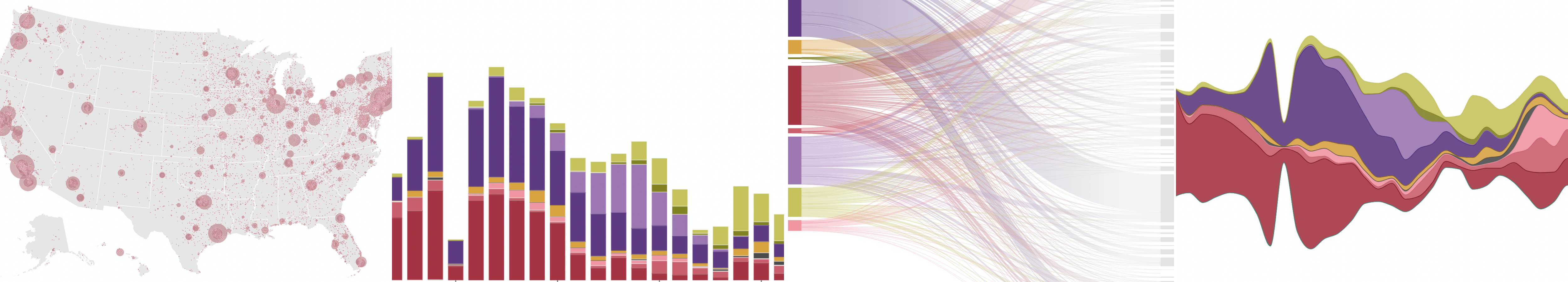
One dataset can be represented in multiple ways depending on what you want to focus on: want to showcase evolution over time? A line chart will do the work. Care to emphasize the geographical distribution of the data? Then a map is, most likely, the best choice. The exercise of trying to come up with as many charts as possible is not only fun — that is if you are a data visualization geek like most of us here at Flourish — but also useful to understand the strengths and weaknesses of each chart type in a given situation and… […]
Some of the world’s biggest pharmaceutical companies have played a central role in the COVID-19 pandemic. However, it’s likely no surprise that the pandemic has also been great for many healthcare businesses. In fact, in 2020 alone, the world’s 50 largest pharmaceutical companies still combined for a whopping $851 billion in revenues. In this graphic, using data from Companies Market Cap, we list the largest pharmaceutical companies in the world by market capitalization. It’s worth noting this list also includes healthcare companies that work closely with pharmaceuticals, including biotech, pharmaceutical retailers, clinical laboratories, etc. Editor’s Note: A previous version of… […]

Cette plateforme vise à favoriser la mise en œuvre de l’agenda 2030 pour le développement durable en encourageant un développement intersectoriel et intégré des politiques publiques. Elle permet d’identifier les synergies et de minimiser les compromis à faire parmi les politiques publiques visant à atteindre les Objectifs de Développement Durable.L’Institute for Global Environmental Strategies (IGES) créé en 1998 en tant qu’organe consultatif japonais vise à promouvoir la recherche pour accélérer la transition vers une région Asie-Pacifique plus durable, résiliente et inclusive. Une équipe de recherche y développe depuis 2015 un outil d’aide à la décision politique permettant non seulement la… […]
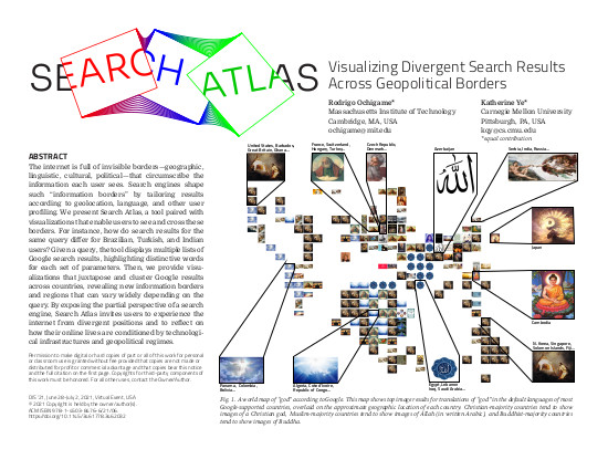
1Massachusetts Institute of Technology, 2Carnegie Mellon University (equal contribution) with design by micah epstein appearing in ACM Designing Interactive Systems (DIS 2021) Contact: team@searchatlas.org Talk Teaser video The internet is full of invisible borders—geographic, linguistic, cultural, political—that circumscribe the information each user sees. Search engines shape such “information borders” by tailoring results according to geolocation, language, and other user profiling. We present Search Atlas, a tool paired with visualizations that enable users to see and cross these borders. For instance, how do search results for the same query differ for Brazilian, Turkish, and Indian users? Given a query, the tool… […]
.png?width=624&name=Anzo%20p72%20architecture%20diagram%20-%20AU-focus%20(3).png)
Because much of the information stored in modern enterprise data ecosystems comes in the form of textual data, an enterprise-scale knowledge graph platform must be able to integrate large collections of this unstructured data. Knowledge graphs need to surface facts from these sources, connecting them to and analyzing them alongside more structured data, such as relational databases, data lakes or APIs. This blog showcases one example of a production customer using Cambridge Semantics’ knowledge graph platform, Anzo, to do exactly this. Anzo treats unstructured data as a first-class citizen in the knowledge graph. Anzo onboards unstructured data — sources that… […]
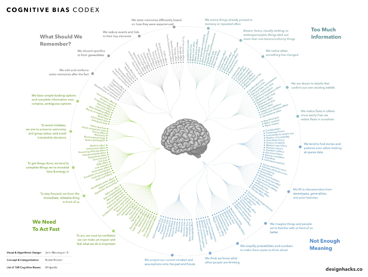
View a high resolution version of this graphic Every Single Cognitive Bias in One Infographic View the high resolution version of today’s graphic by clicking here. The human brain is capable of incredible things, but it’s also extremely flawed at times. Science has shown that we tend to make all sorts of mental mistakes, called “cognitive biases”, that can affect both our thinking and actions. These biases can lead to us extrapolating information from the wrong sources, seeking to confirm existing beliefs, or failing to remember events the way they actually happened! To be sure, this is all part of… […]